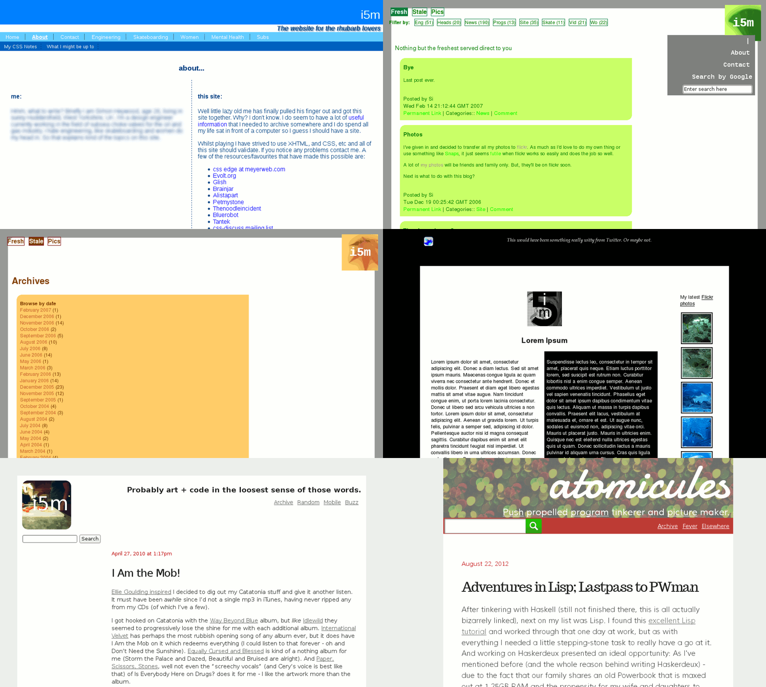
Ten years old today! So to celebrate I’ve put together an annoying animated gif showing the various transformations of this site over the years.
I’ll not bang on about the technical changes as I’ve mostly documented that elsewhere (add to that post a move from Tumblr to Jekyll/Github in March 2011 - strangely undocumented - and the domain name change at the start of this year; also filter the archives by “Site”).
Or go over the various accompanying changes in focus and content. I’m sure that is also referred to elsewhere.
One thing seems obvious: I’m never very settled. I guess change is good?
I’m not the most arty person in the world, but I have always tried to have a go and I’m fairly happy with how my site has looked through the years. I’ve been using CSS since day one - which is partly the reason why it took me two years to launch it in the first place - you can see that from the text shadow in the first screenshot, which must have always been there, but probably didn’t render in many browsers at the time. It was only when putting these screenshots together recently that I noticed.
There’s three screenshots of one version of my site as they are the different colour versions I had for various sections (Green for “fresh content”; Orange/brown for “stale” (archive pages); and “pink” (why?) for the photo pages). I couldn’t decide which screenshot to use so picked all three.
I wonder what on earth it’ll look like in another ten years time?